The new logo is not drastically different from the past, it simply brings a new modern spirit while the blue color remains dominant of the brand.
The last time Intel changed the logo was in 2006. Now the company has a new look with a modernized style. The new icons and style comes along with the debut of 11th generation Tiger Lake and Project Evo processors.
The changes come at a historic moment when the company has struggled with transitions to new architectures and Apple abandoned it in favor of its ARM processors. Still remains a leader in performance as it continues to work on 7-nanometer architecture problems.
The new logo is not drastically different from the past, it simply brings a new modern spirit while the blue color remains dominant of the brand.
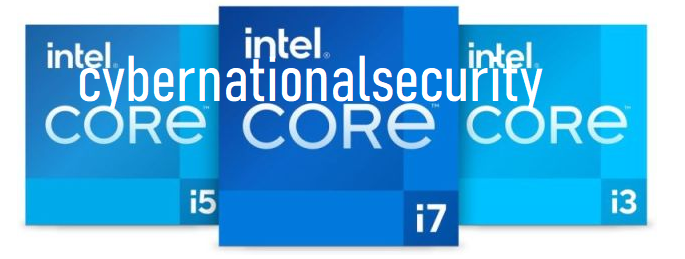
In addition to the logo, the “Intel Inside” labels that you see printed on laptops or desktops have been redesigned. The elements will be refreshed over the years with the debut of new products with Intel processors.
To date Intel has had three logos. The first debuted in 1969, the Intel Inside in 1991 and the last one we have today.
Recent years have proved difficult for the company which faces competition from AMD and ARM. Your brand comes at the moment of truth for the company.
More details you can find here.